How to Guide: Design Compelling Mobile Menu

It doesn’t matter what logo, menu button or navigational system your mobile site has but it’s critical for every mobile site to be unique.
More than 70% of internet users are on mobile, so it’s more than essential for brands to build an intuitive mobile site that encourages users to interact. The contents of the site must be visually appealing and should inspire audiences to browse further.
Navigational buttons that stand out
There are few facts every designer should remember while creating a navigational button.
- Should be large enough for your customers to tap. (44px x 44px)
- The button should be placed on familiar location.
- Accompany the button with a text description.
While placing buttons on your mobile site always make sure that the menu button is placed in the prime location. By doing so, you can make your button look interactive and drive maximum engagement.
Meanwhile, if the button is small and not easily clickable, then your audiences might prioritize your competitors’ site.
Location
The most popular location for menu and other navigational buttons on a mobile site is at the top of the web page. In most cases, the location of the menu button on a mobile site is identical to a desktop site. Some brands might place the menu button in the middle of the page, but, in all cases menu button works best if it is placed on the top right or left corner, accompanied by your brand’s logo.
Apart from that, you can also feature a sticky navigational bar that remains at the top of the screen even though you scroll towards the bottom of the page. This fascinating feature has already been introduced in many IOS apps including Facebook and Instagram, but on the counter side web and android are yet to introduce this feature on their apps.
One of the most compelling examples of the sticky menu bar is Google maps. As you scroll through the app to find a particular location, the menu bar will always stay on the top regardless of vertical and horizontal zooming.
Also, have you noticed that the navigation buttons on this fascinating app are located on the prime spot? This allows the customers to access all the functions without any hassles.
Menu discipline
There are no hard rules while designing a custom menu button, but there are tons of recommendations from the experts. Its best if you take the logical approach, prioritize the sections that are popular among your competitors. Test different format with real time customers and figure out which one works best instead of depending upon assumptions.
Analyze the results and determine the menu items that can take your customers deeper into your site.
Here are few recommendations for the open menu.
- Use categories familiar to your customers.
- Condense the list of items to the minimum and only feature relevant sections.
- Highlight the link areas and make them easily clickable for your customers.
- Make it easier for the customer to track subsections by using signs and arrows.
- Don’t put buttons on the middle of the page.
- In all cases, provide an easy-to-use and intuitive menu to your customers.
Types of mobile menu
There are dozens of approaches to mobile menus. Amongst all, we have compiled some of the popular ones that are popular among popular brands.
Menu Overlay: Tapping this menu drops one or two columns of categories on the top of the webpage. After tapping, the menu sign changes into an X sign, which when tapped closes the menu.
Full-Screen Takeover: When the menu bar is tapped, an overlay is created which covers the entire screen. As this happens, the menu sign changes into an X sign which when tapped closes the overlay menu.
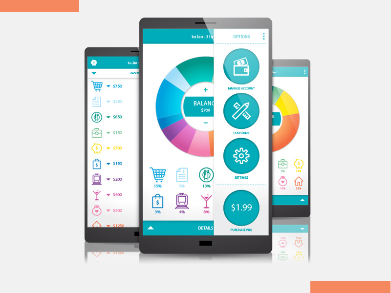
Off-canvas: A quick slide from the right of the webpage opens this menu. One-third or a quarter of the page still remains visible, which is covered by a shadowed overlay. To go back to the main page just tap on the home screen or the close menu button.

